Business Background
Epic Planner is a cutting-edge wedding planning platform that simplifies and enhances the wedding planning process.
Connects users with a wide range of event vendors and service providers for seamless planning and execution.
Aims to bridge the gap between clients and vendors, ensuring a hassle-free planning experience.
Epic Planner
Wedding Planning Web Design
Project Overview
Epic Planner is a wedding planning platform created during a UX/UI bootcamp. This project focused on building an intuitive and user-friendly experience where couples can easily browse, connect with, and book wedding vendors, while vendors can showcase their services and grow their business.


Duration
3 months - Part Time
Team
Group of 5
Role
UX /UI Designer
Tools
Figma, Adobe Photoshop, Canva, Zoom, Maze
Project Tasks
Design a user-friendly website that allows engaged couples to seamlessly browse wedding venues by location, view detailed venue information, and complete the booking process with ease.


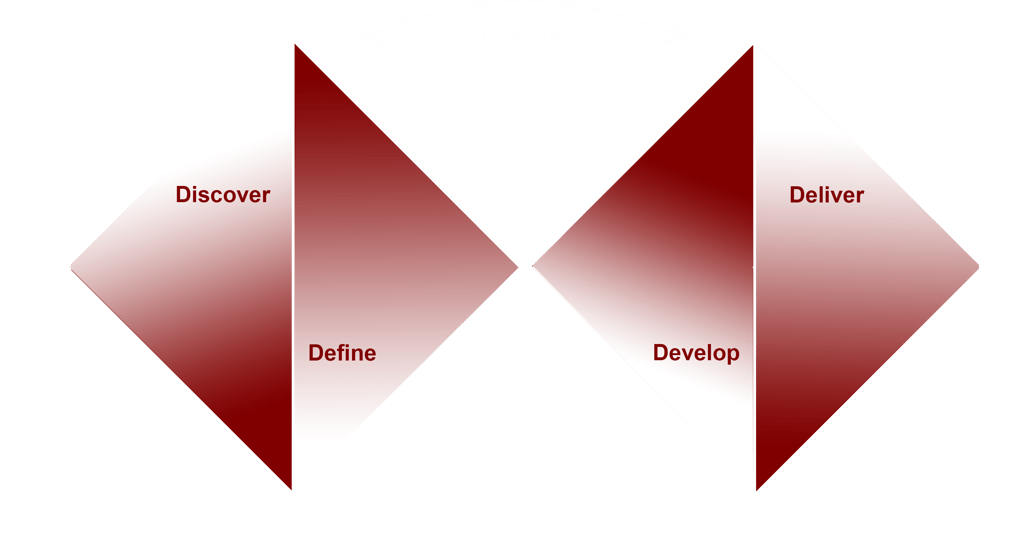
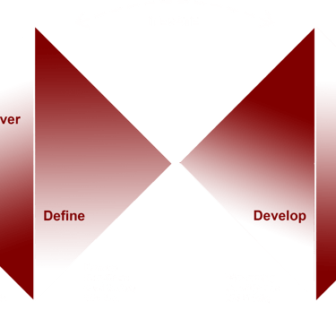
Design Process
Our team of five utilized the Double Diamond framework, based on the Design Thinking methodology, to shape our process. Instead of adhering to a strictly linear approach, we moved through stages iteratively, continuously refining our solutions as the project progressed.


Discover
We conducted our research in two phases:
Phase 1: Interview
Phase 2: Competitive Analysis
Interview
Then we followed up with 5 participants to better understand their pain points.
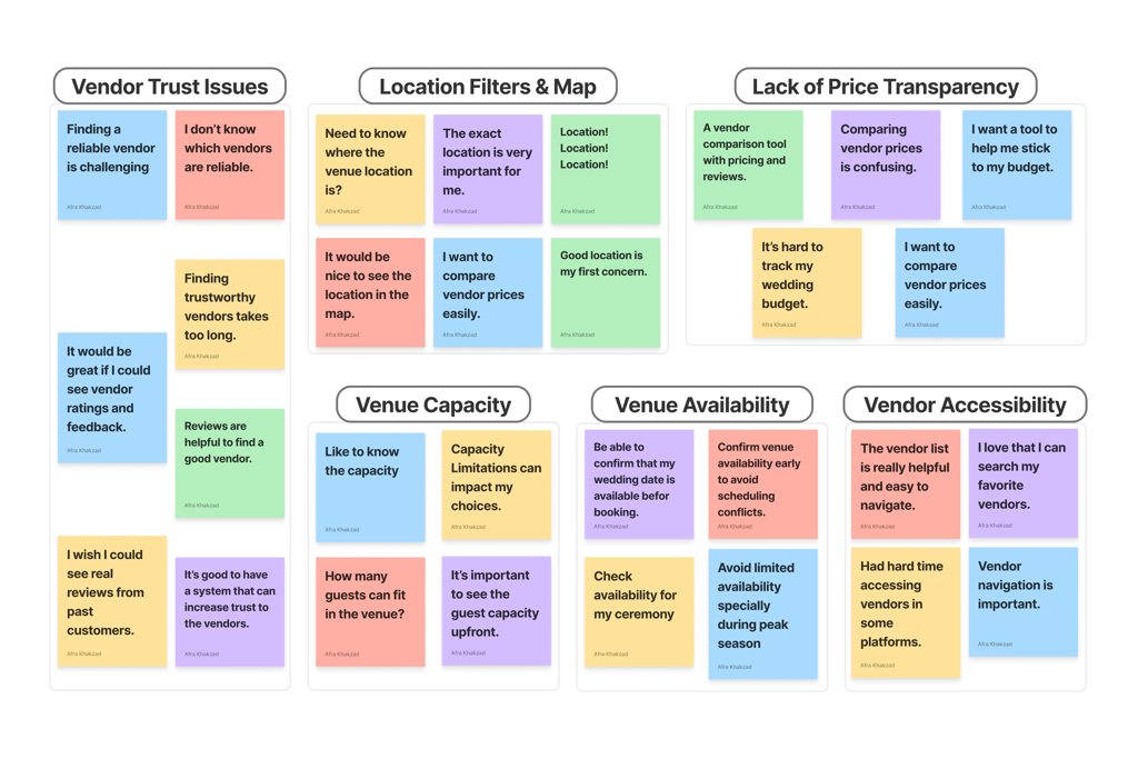
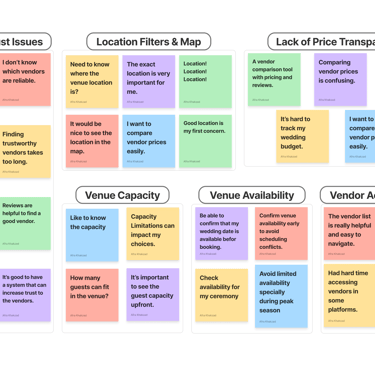
Key Takeaway from Affinity Mapping
The affinity diagram revealed 5 common pain points users face when planning events:
• Users need trust signals like verified profiles, authentic reviews, and transparent business info to feel confident choosing vendors.
• They want clear, upfront pricing to save time and better match options with their budget.
• They need to see venue locations on a map to evaluate convenience and accessibility.
• Users expect visible guest capacity for venues to speed up decision-making.
• They want an availability calendar to avoid the frustration of discovering dates are unavailable after inquiry.
• Users need easier navigation with clear categories and filters to quickly find suitable vendors.
Competetive Analysis
We analyzed 3 similar websites, exploring their features and user flows. This helped us design a more efficient information architecture and identify the key features our website should include.
• Advanced Search Functionality: Supports users in narrowing down vendor options by simultaneously filtering based on location and event date, streamlining the search experience.
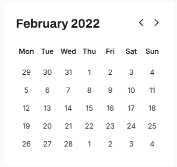
• Real-Time Availability Calendar: Empowers users to instantly view venue availability, reducing friction in the booking process and improving decision-making speed.
• Interactive Map Integration: Allows users to visually explore and compare vendor locations through an interactive map, improving spatial awareness and supporting location-based decision making.
• Transparent Venue Details: Provides users with upfront access to essential details like pricing, guest capacity, and customer ratings, fostering trust and reducing uncertainty in vendor selection.
• Accessible Vendor Search: Organizes vendors into intuitive categories (venues, photographers, music, etc.), helping users easily navigate a wide range of services and minimizing search effort.
Define
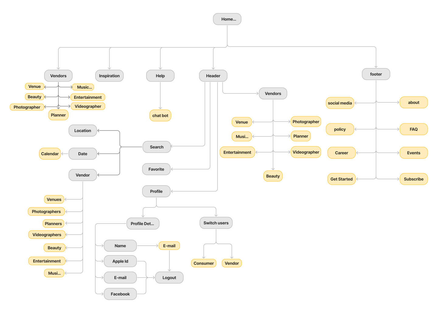
Site Map
This storyboard illustrates a typical scenario our user might experience, based on the persona. It helps visualize their context, challenges, and emotional journey to better guide our design decisions.
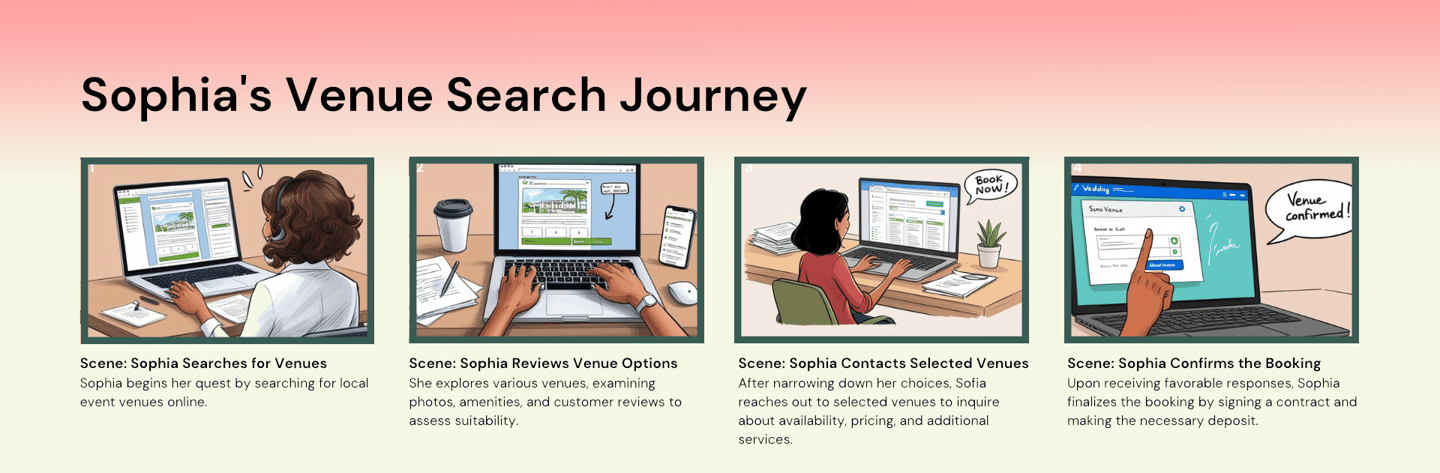
Storyboard
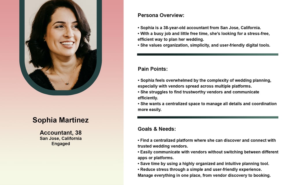
Persona
Card Sorting
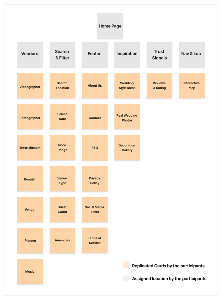
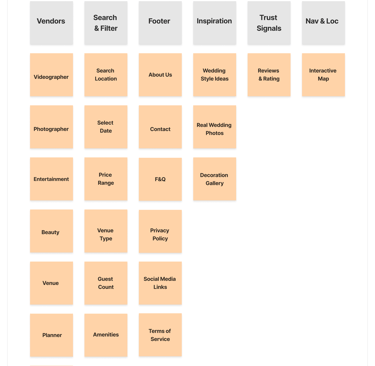
To better understand how users expect information to be grouped, we conducted a card sorting exercise. This helped us organize the platform’s content in a more intuitive and user-friendly way. The insights from this activity guided our decisions for navigation, search filters, and overall layout, making it easier for users to find what they’re looking for quickly and confidently.
Develop
Ideation & Wireframing
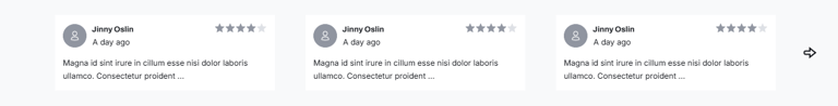
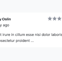
Add a review and rating system on each vendor profile to help users feel more confident when choosing a vendor.
Deliver
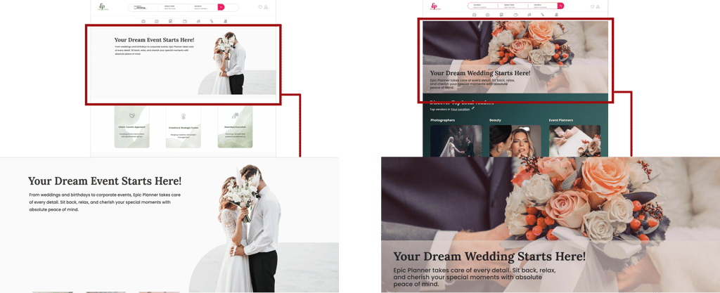
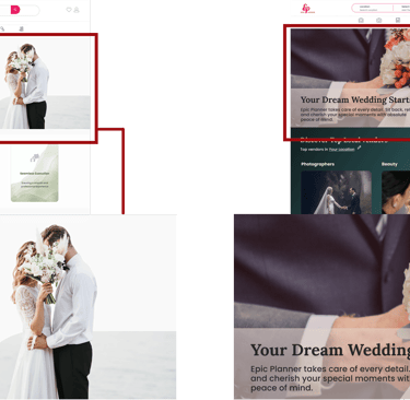
Afrer
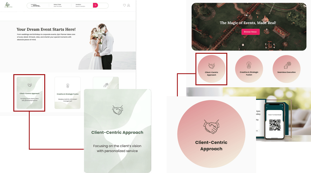
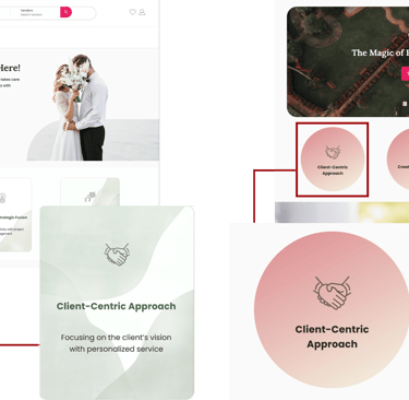
After a usability test, we changed the hero image to better reflect the website’s purpose. The new image creates a stronger first impression and connects more clearly with users.
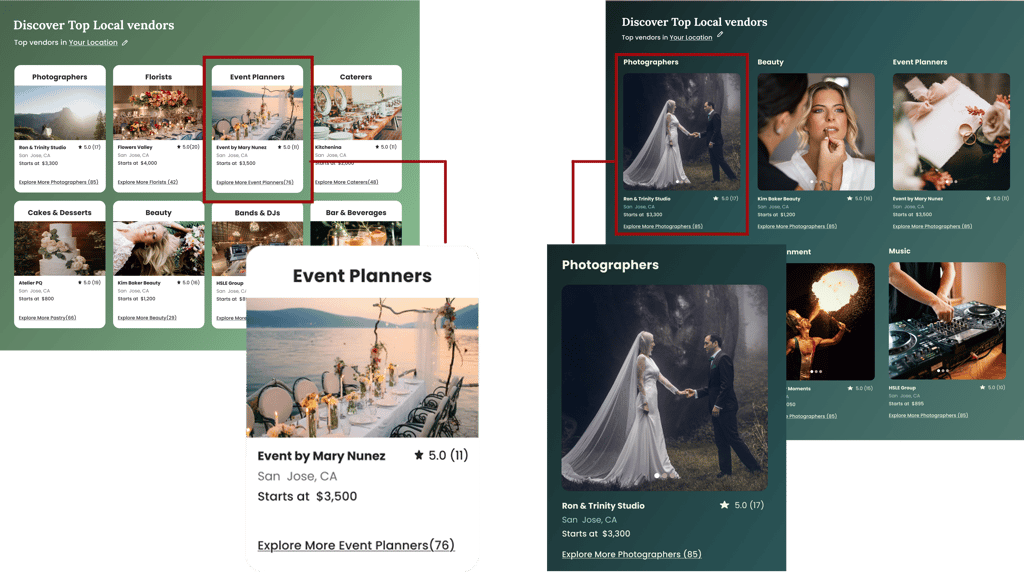
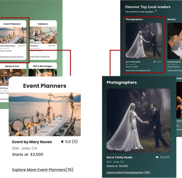
We updated the card design and color palette to improve readability and create a more modern, cohesive look that guides users more smoothly through the content.
We redesigned the value proposition section by changing its shape, color, and placement. Moving it closer to the middle of the page and improving its visual style made it more noticeable and easier for users to understand the key message.
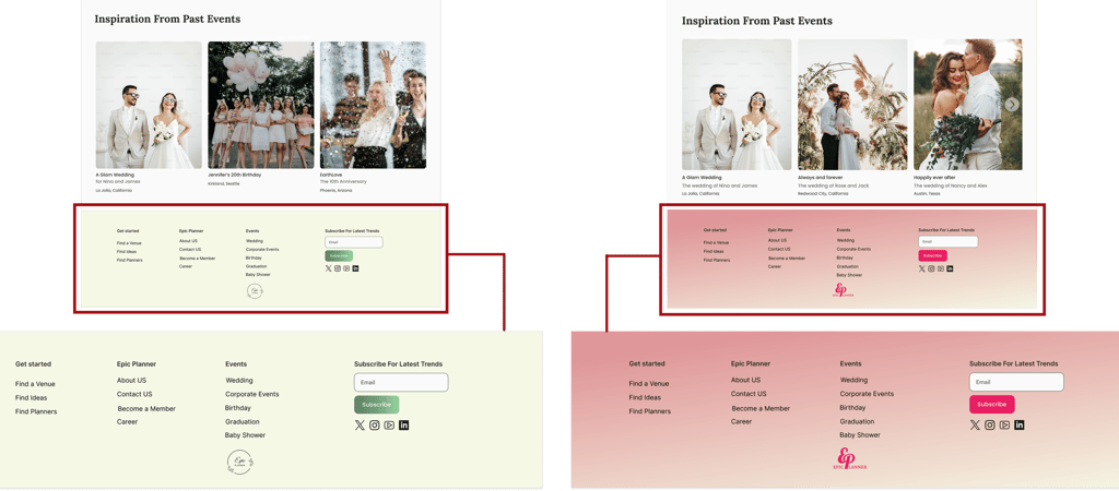
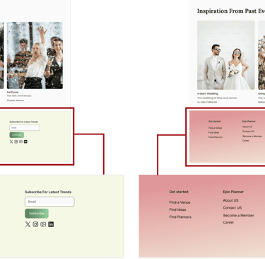
We changed the footer color from light green to light pink to create better visual contrast with the rest of the page and make the footer content easier to read and more visually appealing.
Usability and Iteration
Before
These are the core visual elements for Epic Planner, including the color palette, typography, buttons, and components. The UI Kit helps maintain visual consistency and supports an efficient design-to-development handoff.
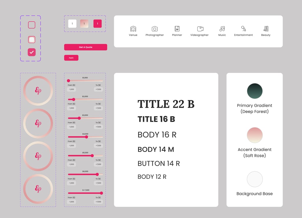
Design System
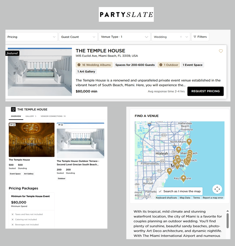
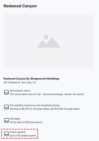
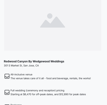
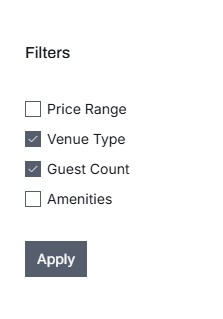
Provide intuitive filter and sort options (e.g., by price, rating, capacity, location) and organize vendor profiles with consistent layout and navigation for easy browsing.
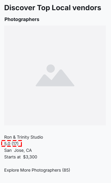
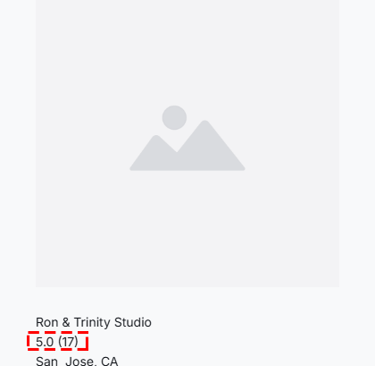
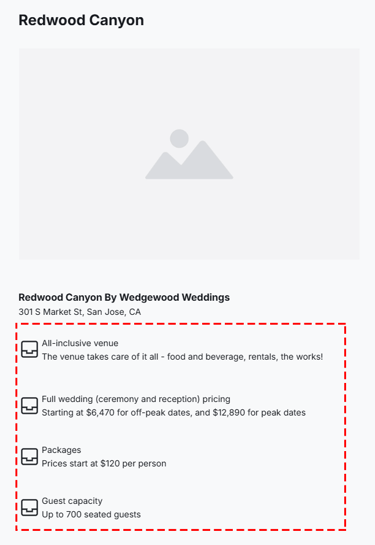
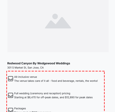
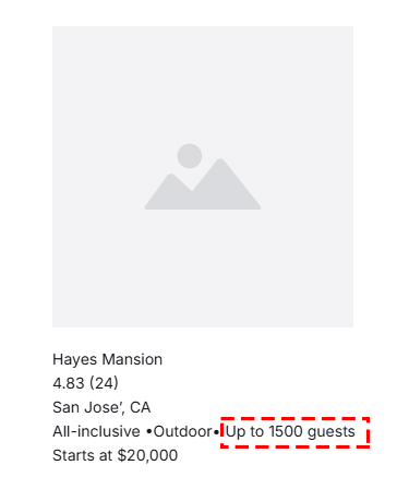
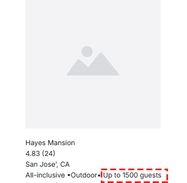
Display clear pricing information on vendor cards and detail pages, including starting price, package options, and any additional fees.
Integrate an interactive map view and location-based filters (e.g., distance radius, city/neighbourhood filter) to help users quickly find venues near them.


Include visible guest capacity ranges (e.g., "Up to 100 guests") on venue listing cards and inside the venue description page.
Availability calendar that allows users to check real-time availability before contacting or booking a venue.


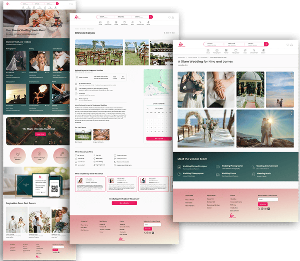
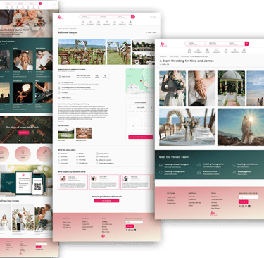
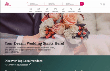
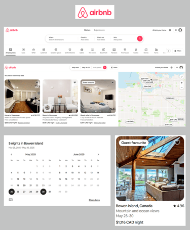
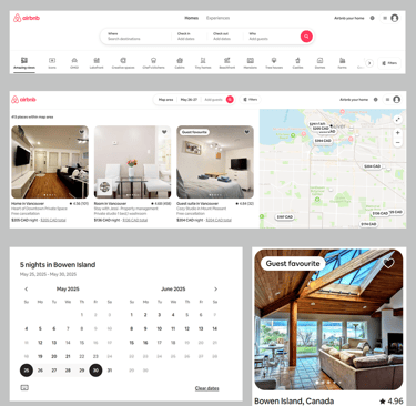
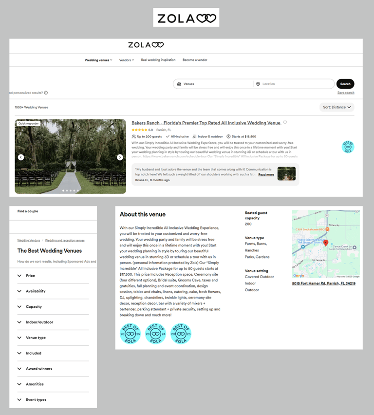
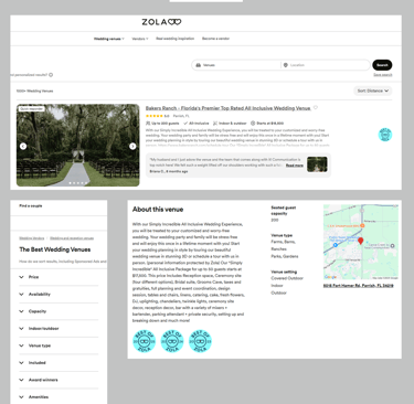
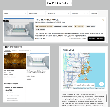
High Fidelity Prototype
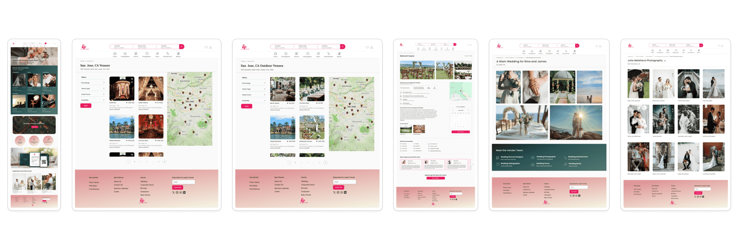
Home page
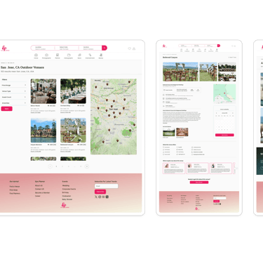
Choose a location
After filters
Get a quote for a venue
Inspiration
Photographer's gallery
Reflections
What did I learn?
I learned how to collaborate efficiently in a team and communicate design ideas clearly.
I discovered the value of usability testing in identifying pain points and improving the user experience.
I gained experience in building a consistent and accessible design system for handoff to developers.
What can we do next?
In the next phase, we can focus on attracting vendors to join the platform by creating profiles and adding their services.
UX can support this goal by designing a smooth and engaging onboarding flow, making it easier for vendors to get started and feel confident using the platform.
This way, we help the business grow while also making sure the experience works well for both sides.